OVERVIEW
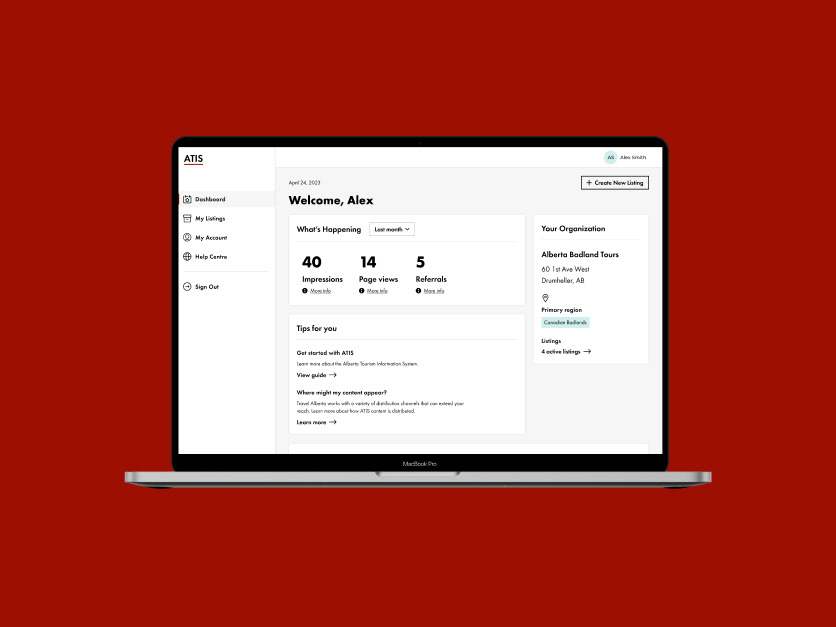
Travel Alberta, the official destination management organization for the Government of Alberta, is crucial in promoting tourism development and marketing throughout the province. Alberta Tourism Information Service (ATIS) is Travel Alberta’s flagship tool for managing and promoting tourism businesses across the province on TravelAlberta.com and partner websites. With the reimagined ATIS platform set to launch, Travel Alberta needed a way to quickly familiarize tourism business operators with the new features and functionality.
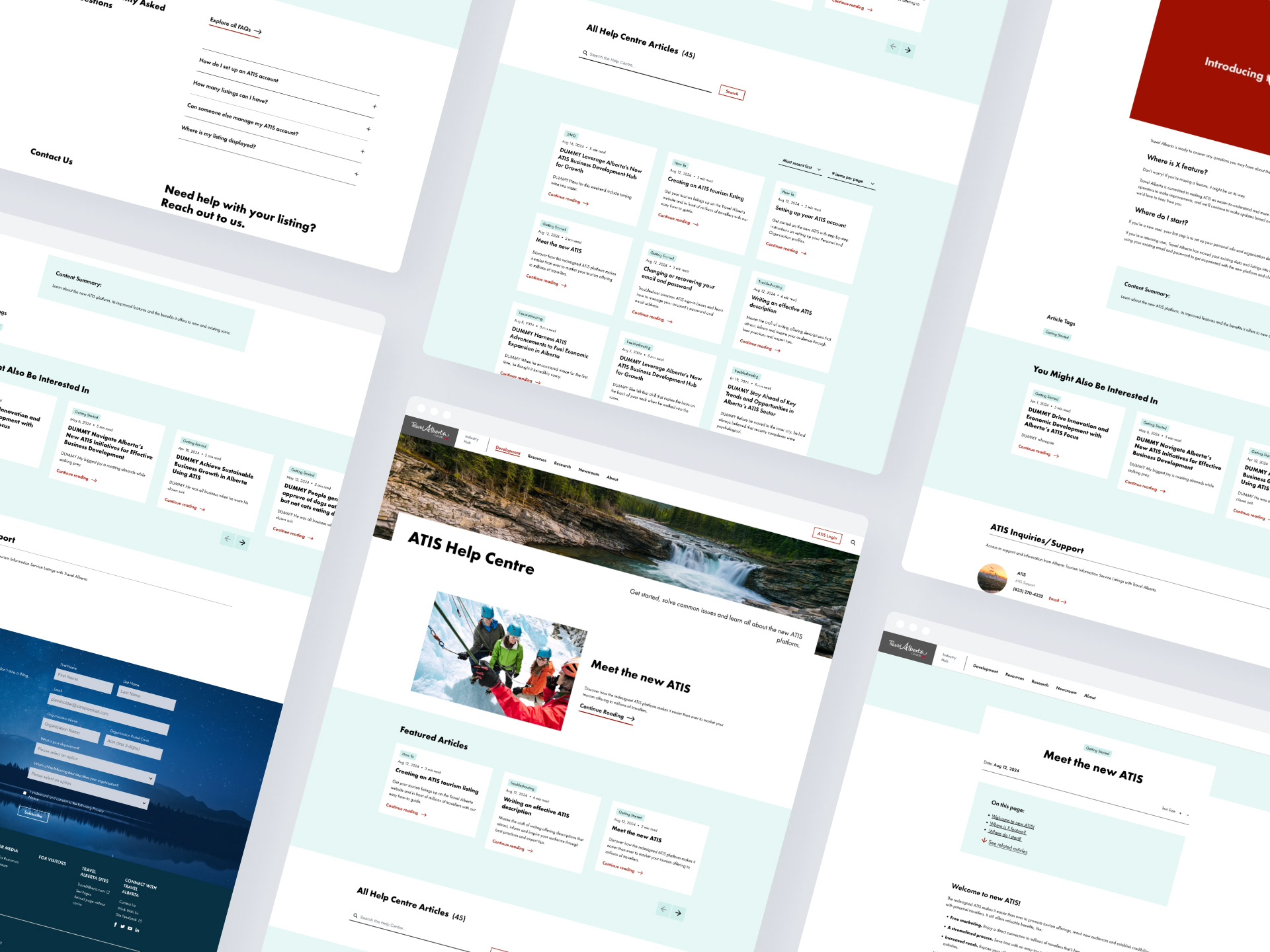
The goal was to create an easy-to-use help centre that serves as a centralized support hub for all ATIS users and to create comprehensive and accessible support content that enables users to quickly leverage the platform’s benefits.
CLIENT
Travel Alberta
TIMELINE
4 months
ROLE
User Experience, UX Writer
Discovery
Competitive Benchmarking
As part of the research for the help centre design, we conducted a competitive analysis by identifying key competitors in the industry. We compared the layout, features and functionality across all of them, determining benchmarks and best practices that could be applied to our design. This analysis helped us establish standards for usability, navigation, and content organization.
Feature Prioritization
To further refine the feature set, we facilitated a dot-voting exercise with stakeholders. This allowed them to prioritize the most critical features for launch, ensuring alignment with user needs and business goals.
Content Inventory and Audit
I conducted a site audit to evaluate the website's existing content and identify gaps in the support materials. This process involved assessing outdated, redundant, or overlapping content and determining what needed to be updated, consolidated, or removed. The findings ensured the content was updated and aligned with the platform's new functionality.
I conducted a site audit to evaluate the website's existing content and identify gaps in the support materials. This process involved assessing outdated, redundant, or overlapping content and determining what needed to be updated, consolidated, or removed. The findings ensured the content was updated and aligned with the platform's new functionality.
Ideation
Sketching and Wireframes
Insights from the competitive analysis and feature prioritization workshop with the client helped informed my design process. I began with sketches and then developed low-fidelity wireframes. This approach included two versions: an MVP design to address essential features and a post-MVP design to incorporate additional enhancements.
Once the wireframes were approved by the client, I collaborated with our in-house design team to finalize the UI design. The completed design was then handed off to the development team for implementation.
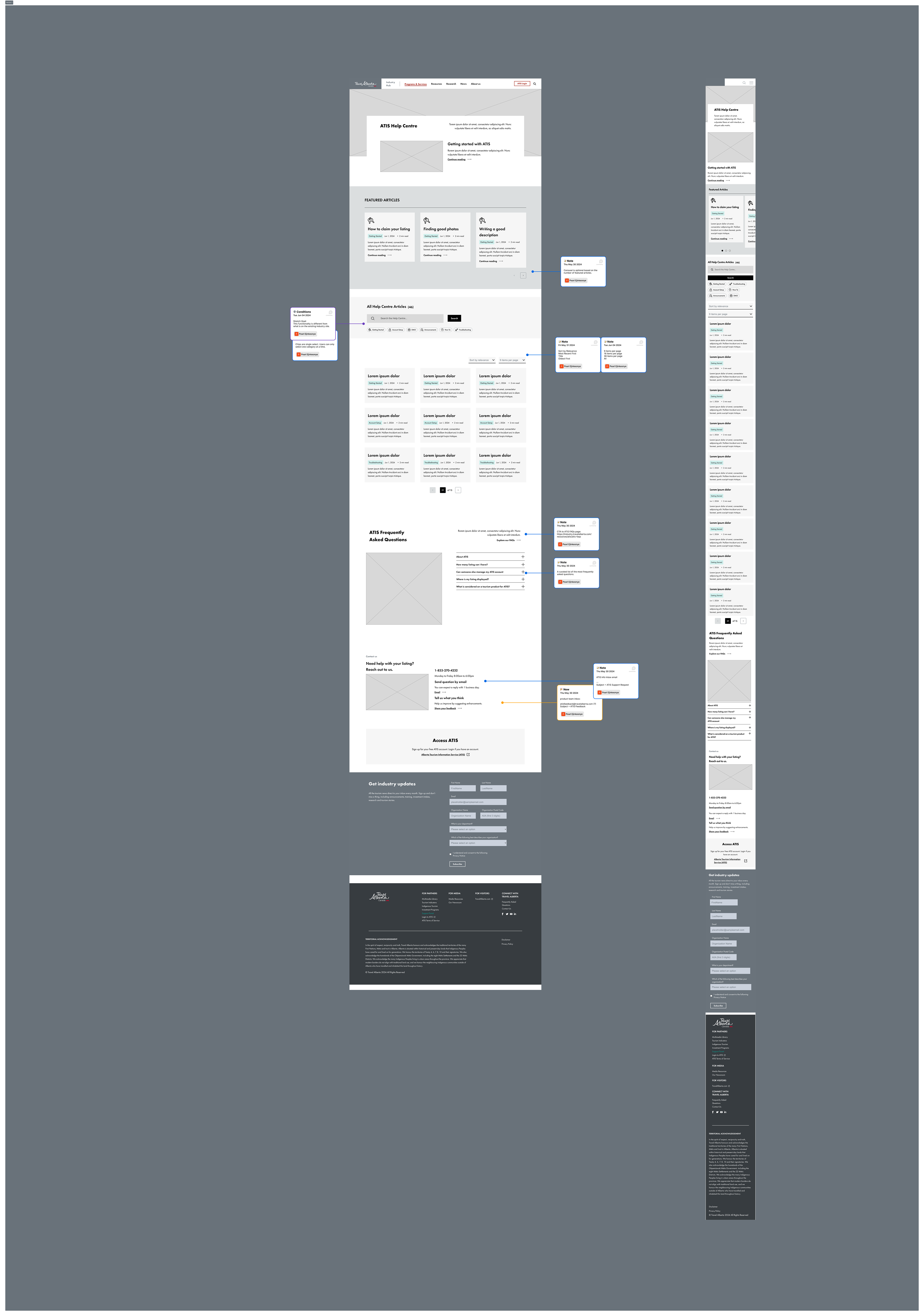
Help Centre wireframes
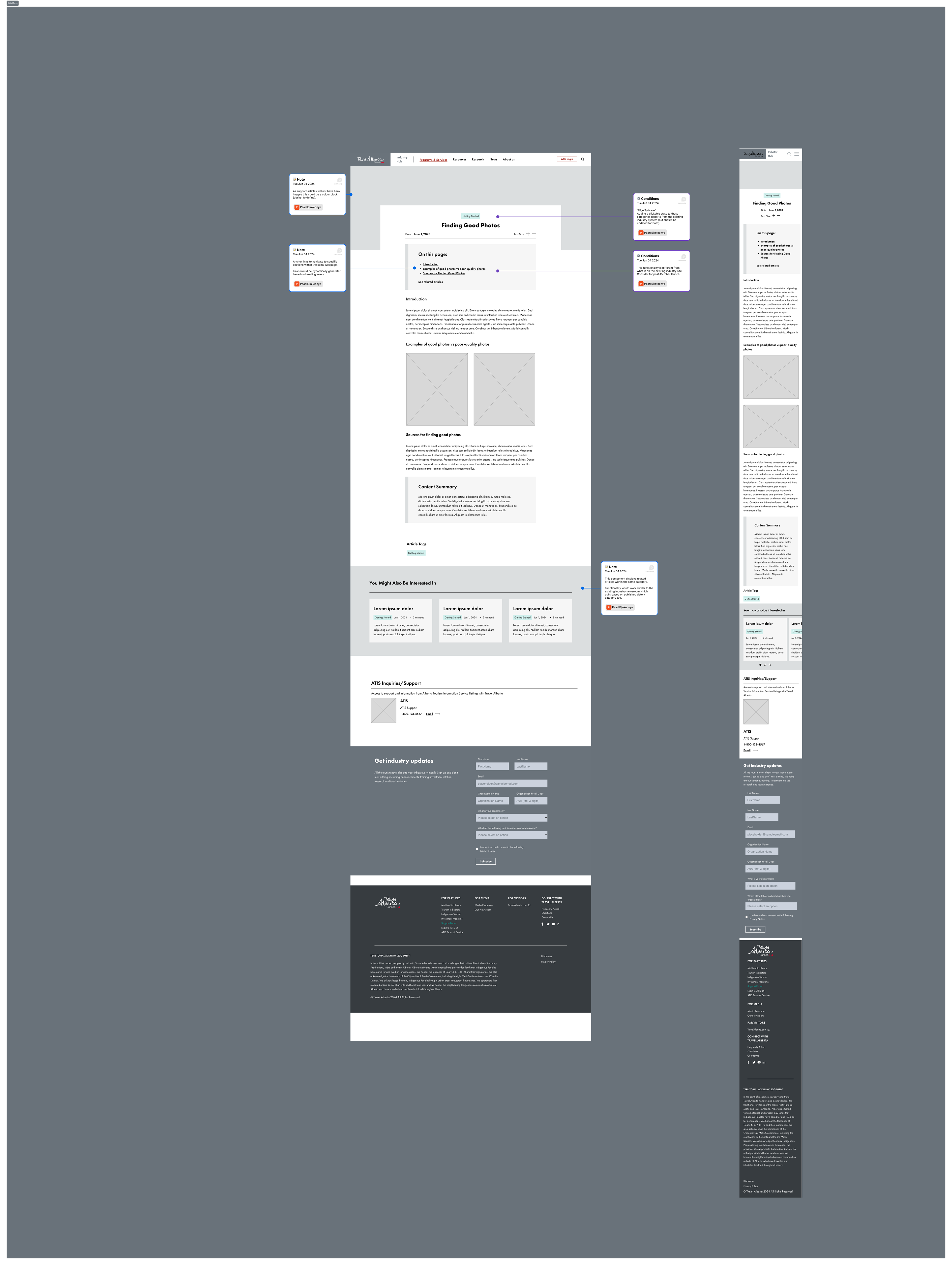
Article page
Content Design
UX Writing
In this phase of the project, the focus shifted to creating support article and educational content for the help centre. This involved;
- Crafting clear and concise, support articles to address anticipated user questions and issues, and;
- Supporting the development of additional educational graphics, such as videos, and how-to guides, to further assist users in navigating the ATIS platform.
Results
Outcomes
- Co-authored and published 10 articles at the launch of the help centre, these articles addressed key user needs and common questions. These articles laid the groundwork for an engaging and informative self-service platform.
- Designed and implemented a robust help centre framework that accommodates future growth. The framework is adaptable for new features, ensuring the help centre remains relevant as the platform evolves and the support content library expands.
- Categorized and organized articles into intuitive sections, enabling users to quickly find the information they need. This structure is optimized to aid user search, reducing the time spent searching for solutions.
Challenges and Learnings:
- Less is more: By avoiding lengthy, overly detailed content, I minimized confusion and focused on actionable instructions, ensuring users had the right amount of information to solve their problems efficiently without feeling overwhelmed.
- Accessible content: The articles were designed to stand alone, providing clear and comprehensive information without relying on supporting graphics to aid user comprehension.
- Setting standards and guidelines for future articles: By creating a framework to ensure consistency in structure, formatting and terminology.
- Self-referential articles: The articles linked to relevant content within the help centre, providing users with additional context, encouraging further exploration, and enhancing SEO performance.
- Prioritization: Technical and time constraints meant we had to take an MVP approach and prioritize the features for the help centre while laying the ground work for future enhancements.